2020 is rapidly approaching, and that signals the dawn of a new decade. Potentially a fresh start for us all, that’s the inspiration that the creative team at Dulux used when they designed next year’s Colour of the Year.
KSL’s designers explain how best to add next year’s on-trend colour into your kitchen design scheme.
How is the Colour of the Year chosen?
Each year, paint colour specialists from the Dulux Global Aesthetic Centre get together with a team of experts including colour designers, trend forecasters, architects and editors from around the world. The panel talk about the emerging global trends that will affect us all during the forthcoming new year. Each year, they focus on just one colour they believe will be capable of positively impacting homes and people all over the world.
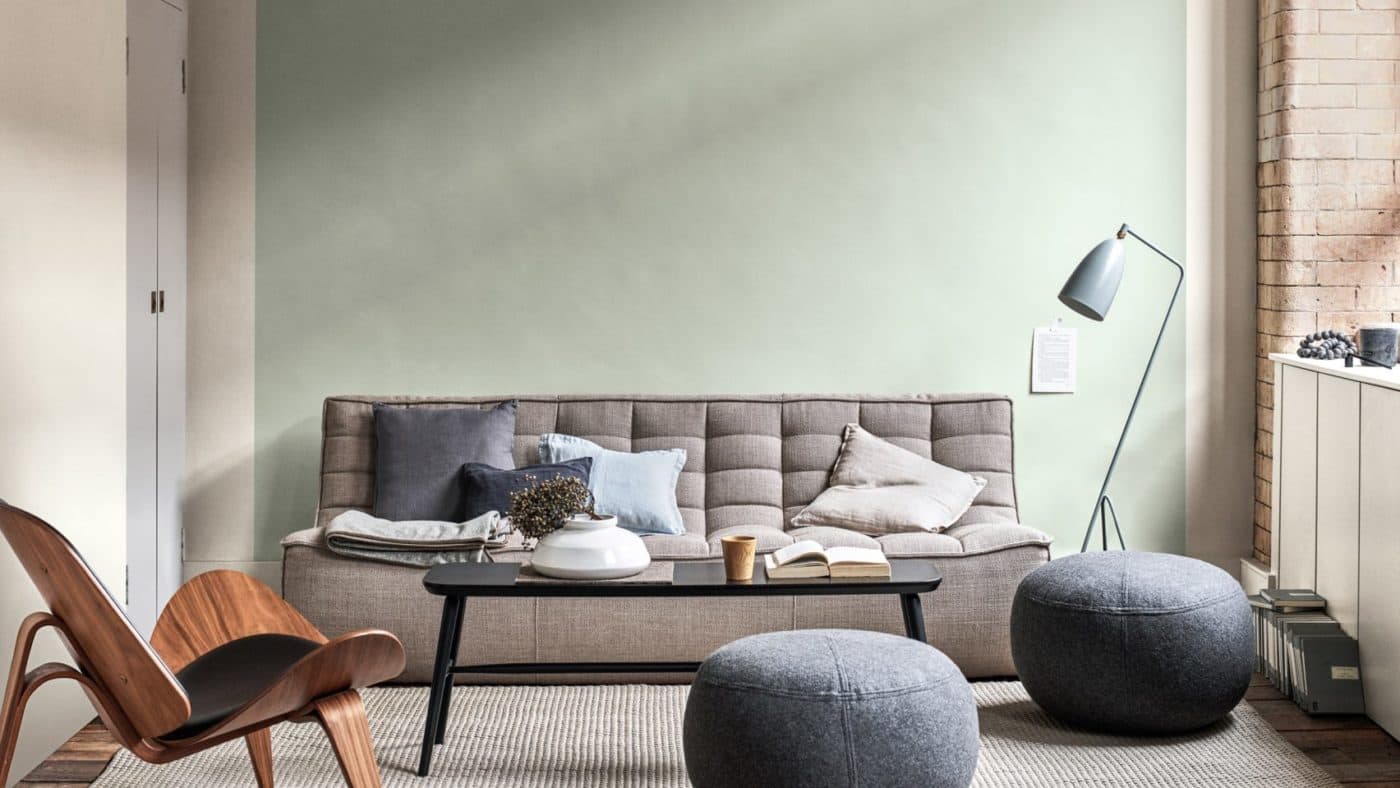
The colour of the year for 2020 was announced last month. It is ‘Tranquil Dawn’, a pale greyish green. From a completely different colour palette from last year’s Spiced Honey, it’s soft green hue is calming and comforting just when we need it most in our lives.
The inspiration for 2020’s Colour of the Year
The colour inspired theme for 2020 is reconnection. In a busy world dominated by technology the panel wanted a colour that could represent ‘a human touch’. There is an overwhelming preoccupation with the state of the planet right now, so a natural, green shade was a logical choice. Studies have shown that rooms decorated with natural colours and materials can make a positive change to people’s physical and mental health.
How to add Tranquil Dawn into your kitchen
So how do you add some Tranquil Dawn into your kitchen design scheme. We’re not saying that to benefit from its calming influence you have to have everything in this colour, you can introduce it in a way that works for you. For some people it might be new kitchen furniture in a similar green tone; for others it might be redecorating the kitchen walls in the new colour; for others it might be adding a splash of the colour by updating tiles, splashbacks or through using Tranquil Dawn coloured accessories.
Updating kitchen furniture
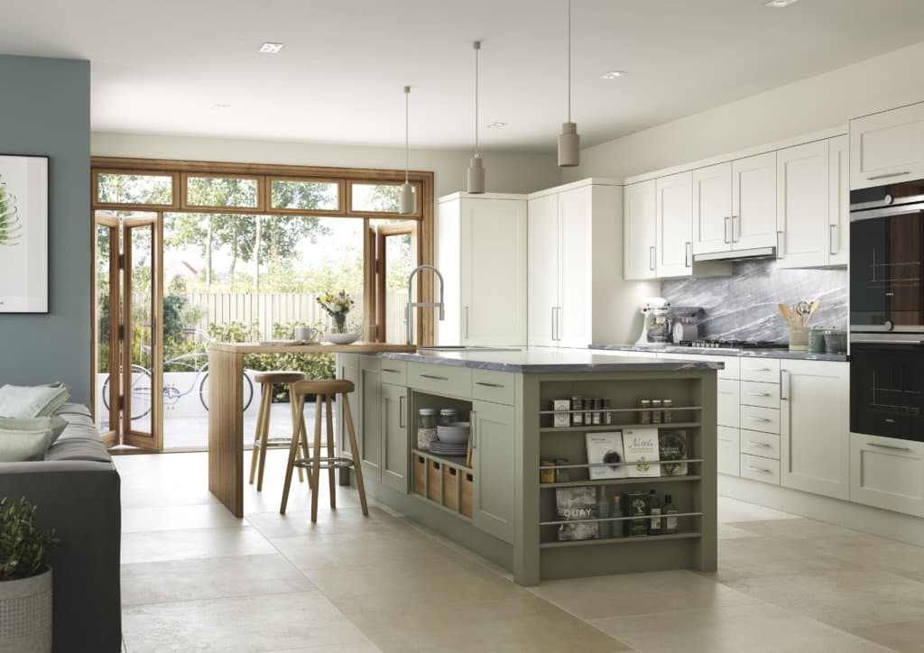
If you are about to embark on a new kitchen project then you could consider choosing a Tranquil Dawn-style colour scheme. You can introduce it to a section of the kitchen, such as an island – which is an easy way to add some colour, but you can be safe in the knowledge that its impact will always be limited.
Or you can use two shades of green that look wonderful together such as the example from Mereway Kitchens – Bridgwater from the Town & Country collection in Prosecco and Dark Sage. The slightly darker shade of green, contrasts with the hint-of-green Prosecco shade. This is a scheme that could easily be given a new or different lease of life in years to come with a change of colour emphasis.
Splashbacks
If you’re not planning an entirely new kitchen project but would like to update to your kitchen aesthetic, a striking way to add a new colour to your kitchen is with your splashbacks.
Colour splashbacks are having a moment, so consider choosing from coloured glass panels to tiles with creative patterns. Our example shows how Tranquil Dawn metro style wall tiles have been laid in a herringbone pattern, rather than the conventional brick effect, bringing even more interest to this strip of wall.
Statement wall
Painting a feature wall in Tranquil Dawn is even more straightforward and less expensive than fitting new colourful tiles or splashbacks. You could add a feature wall to an adjoining dining or sitting area in a larger kitchen space.
Accessorise
If you have a neutral coloured kitchen you can punctuate it with green/grey coloured blinds and soft furnishings such as seat-pads, curtains, tea-towels and oven gloves to inject some Tranquil Dawn into your kitchen design.
Living colour
Bring uplifting energy and instant Tranquil Dawn colour to your kitchen with a plant on your bench top or window sill. A little pot of herbs like basil or mint will give your kitchen a fantastic fresh smell, and add living colour to your space.
Coordinating colours with Tranquil Dawn
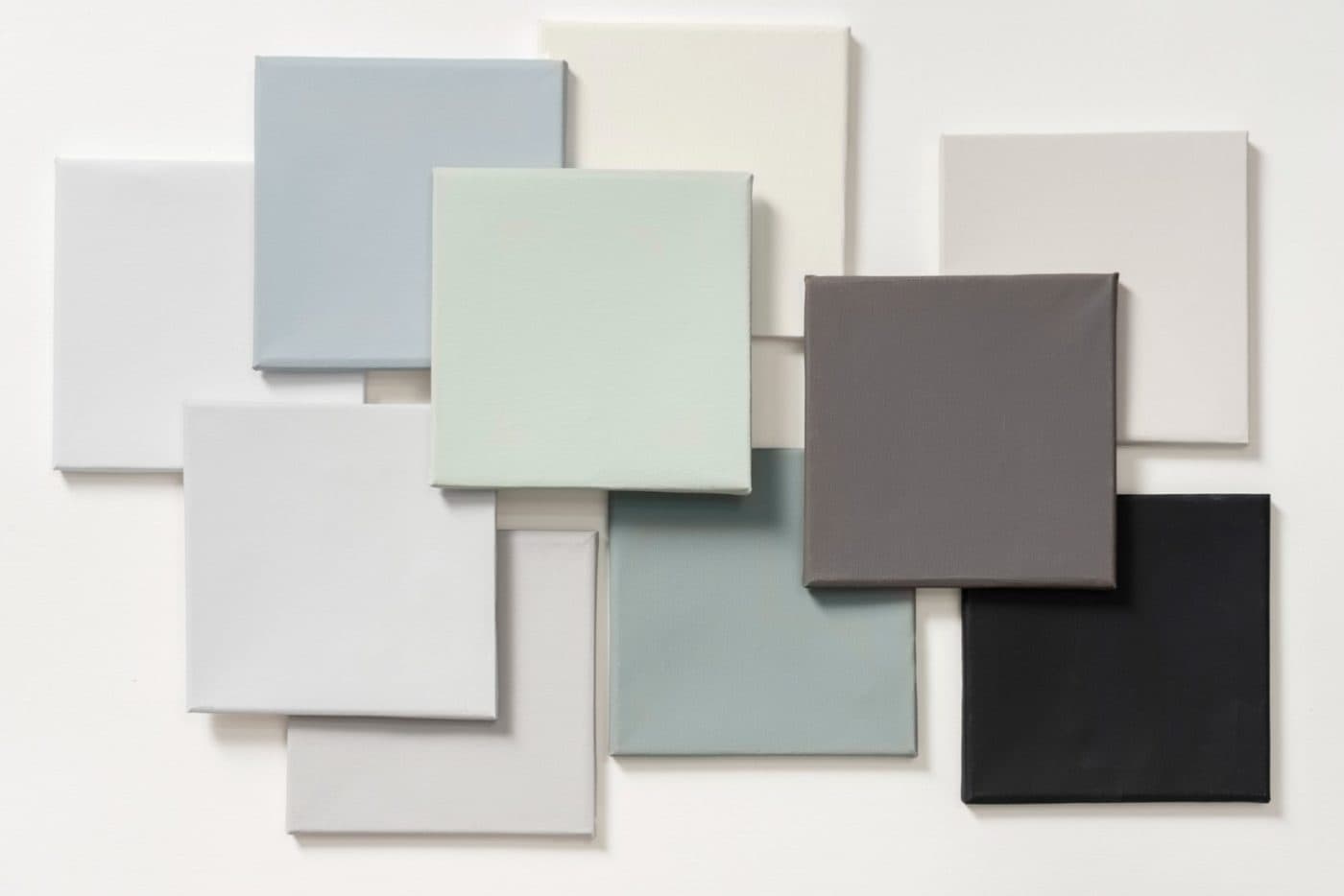
The new colour of the year has some equally stunning trend palettes. The support palette consists of charcoals, off whites and washed out browns. All of the supporting colours have been pulled together to show what works best to make the most of Tranquil Dawn. The colour palette was inspired by the changing sky that comes with different seasons.
Try pairing Tranquil Dawn with neutral pastels for a laid back look or opt for rich jewel colours for a more empowering aesthetic.
For more design ideas why not have a chat with one of our design team. Give us a call on 01787 339023 to arrange an appointment, or just simply pop in to our Sudbury showroom.


