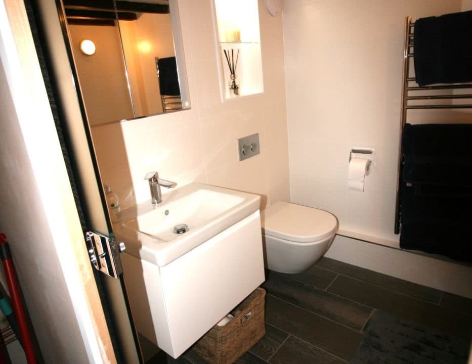
Our client owned a period cottage and wanted a bathroom design that felt clean, warm and contemporary.
Challenge
Our client had reconfigured the ground floor layout of their cottage to maximise space for a new kitchen and new bathroom. The client wanted a contemporary bathroom that would feel clean, bright and modern but yet still fit with the age of their property. As the cottage was such an old building irregularities in the shape of the space that had to be considered. The location of the room – in one of the corners of the cottage – meant that light and warmth were minimal and needed to be addressed.
Solution
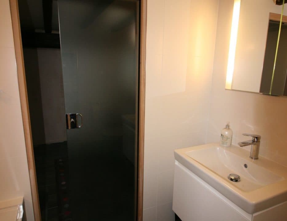
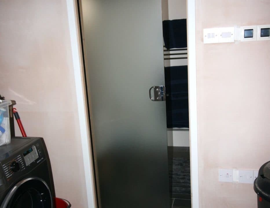
The first thing that we looked at was levelling the walls and insulating the space. We reboarded the whole room to create straight lines and a square space to work with. In order to create as much space as possible we used a sliding door, that was also glazed, with the added benefit of allowing as much light as possible to enter the room .
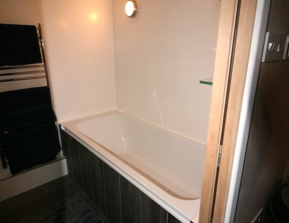
We also insulated and reboarded the floor (as due to the property’s age there was no sub-floor) and added higher output underfloor heating to ensure that the room would feel warm and cosy. An electric towel rail and radiator also added to the heating of the room.
Villeroy & Boch wood effect porcelain floor tiles were used that are far more practical than real wood for a bathroom space.
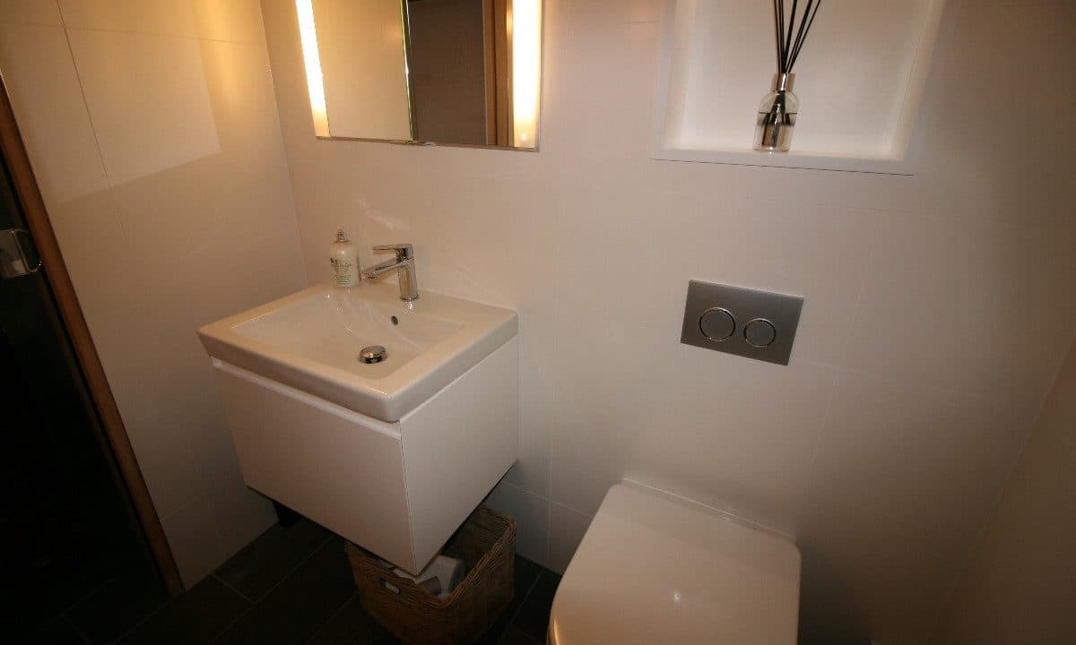
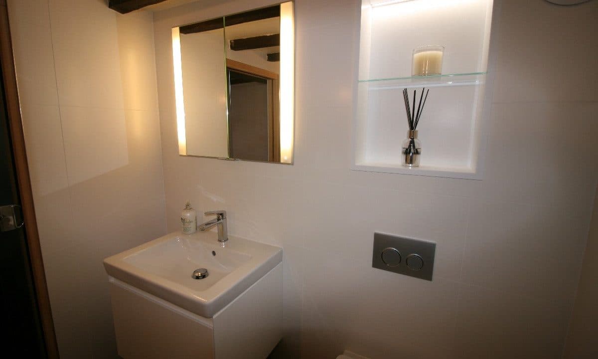
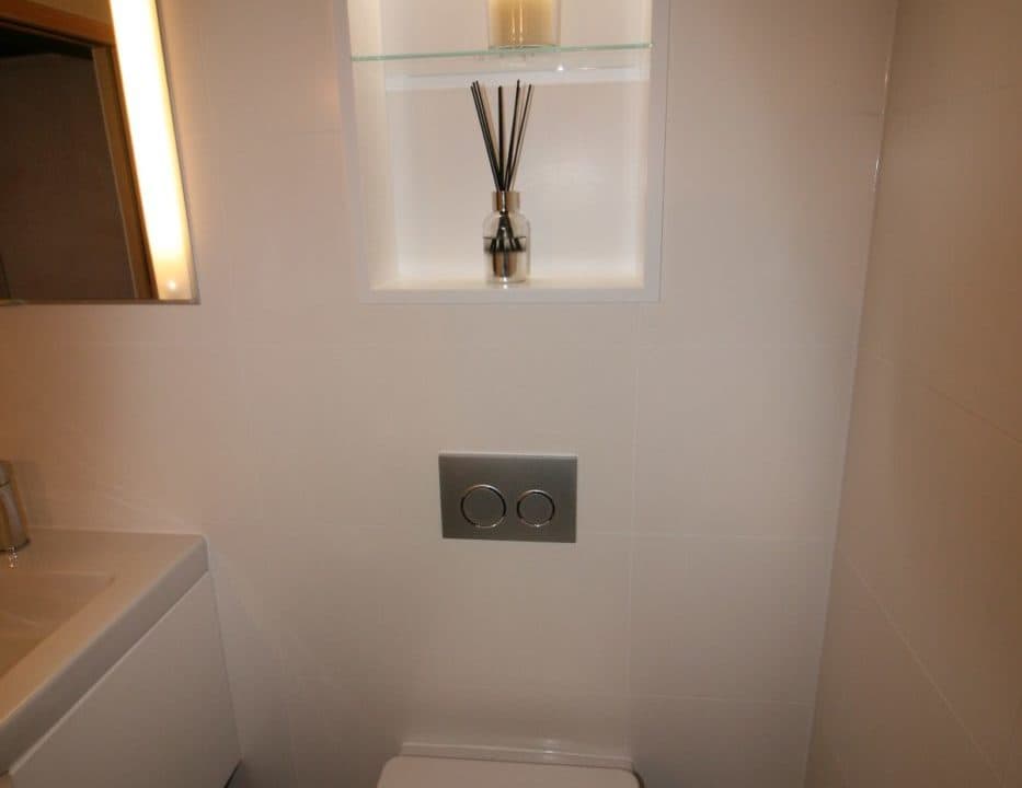
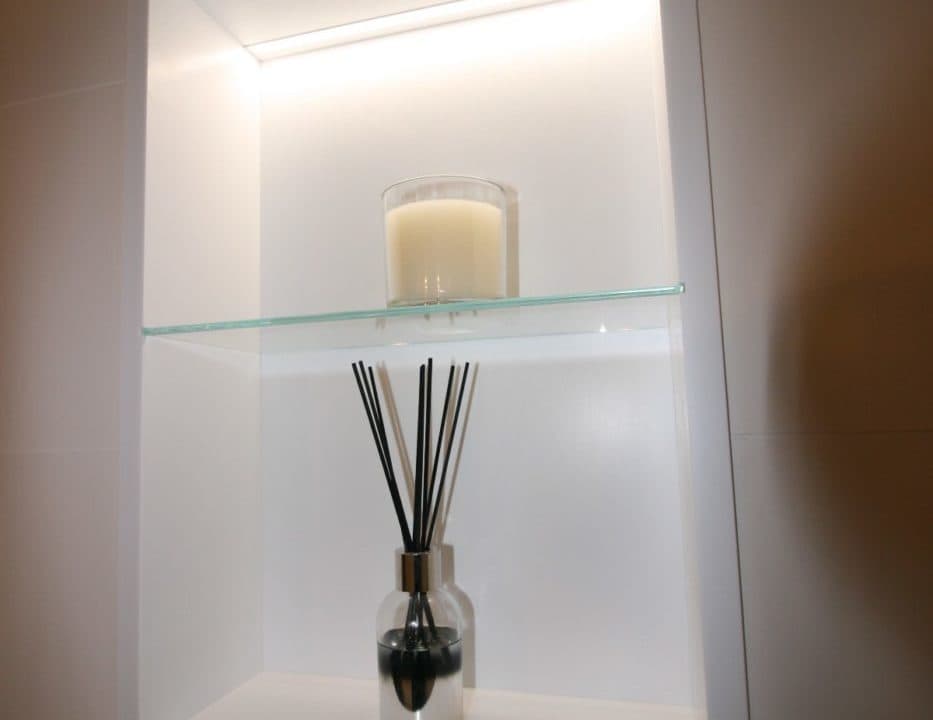
Boarding was added behind the WC to hide the cistern. The boarding enabled us to build a Corian niche illuminated shelving unit with a glass shelf that adds a nice focal point to the room. We also added a Keuco recessed mirror cabinet above the sink.
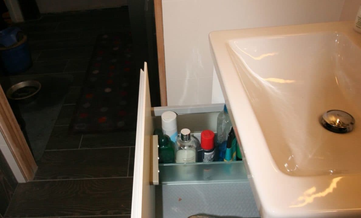
We chose a Bathroom Furniture Company ‘Malmo’ single drawer unit for under a Villeroy & Boch ‘Subway’ basin with Arte Form mixer tap. The client was particularly pleased with the cabinet with its glass sides and drawers and the light that comes on when you open it.
We added a stud wall to the room to create a space to house the Adamsez bath including a Crosswater hand shower and glass shelf for storage.
Again due to the age of the property, the ceiling height was low and therefore it was a better solution to utilise wall lighting. The client also chose Villeroy & Boch wall tiles in plain white porcelain to maximise the brightness of the room.

